Back

New RHS research reveals how flower colours can shape how you feel

Colour plays a powerful emotional role in gardens, a new RHS study has revealed for the first time, offering new insights into how outdoor spaces can influence our moods

The findings of Flower Power: How favourite colours shape how we feel, soon to be published in a scientific journal, showed how colours can affect our moods. By attending to chroma, lightness and hue, gardeners can turn the volume up or down in the garden depending on what atmosphere they want to create.

The study collected data from visitors to RHS Garden Wisley in Surrey between 2021 and 2023 through an ongoing public interactive exhibit at the RHS’s science headquarters, RHS Hilltop.

During this period, 11,569 visitors were asked to pick their favourite flower colour from 36 options. Participants then selected which of 20 emotions, from joy to disgust, they most associated with their choice.

Flower power

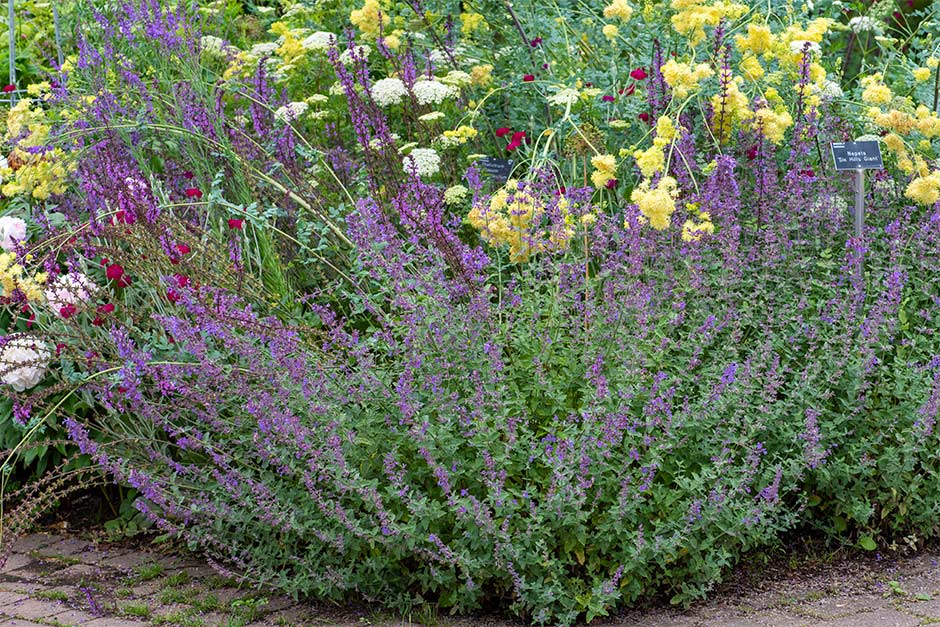
The findings showed purple to be the most loved hue across three seasons, with 26.67 per cent of people choosing it. It was second to red only in winter. This showed how many colour-emotion associations are relatively stable rather than purely transient effects of seasonal exposure.

Salvia × sylvestris ‘Dear Anja’
Geranium Rozanne (‘Gerwat’) 
But hues are just one part of the story. When the scientists broke the data down in a separate test of how colour brightness affected people’s choices, they found that the more intense, vivid hues – known as saturated colours – accounted for 60 per cent of the favourites and produced stronger emotional responses, followed by muted colours (17.9 per cent), dark colours (12.39 per cent) and light colours (7.97 per cent). When taking this colour saturation element into account, bright red ranked first at 12.97 per cent and bright yellow second at 11.90 per cent.

The more saturated the flower colour was, the more people loved it and the more intense the emotional response they had. “Yellow is often seen as the ugly duckling of the gardening world, but in this study the intense, saturated yellow option was the second most popular colour,” said Ashby Sachs, RHS Wellbeing Fellow, who led the research.

Yellow is often seen as the ugly duckling of the gardening world, but in this study the intense, saturated yellow option was the second most popular colour.

Ashby Sachs, RHS Wellbeing Fellow
The RHS research revealed that saturated yellow is a much-loved colour in gardens
“Many studies on colour preference have been done before, but this is the first to examine emotional response to flower colour saturation. We found the most saturated yellows, oranges and reds really turned up the volume on uplifting emotions such as joy, excitement and vitality over the more muted tones, while cooler colours like blue and indigo heightened feelings of calmness and relaxation.”

The most saturated yellows, oranges and reds really turned up the volume on uplifting emotions such as joy, excitement and vitality over the more muted tones.

Ashby Sachs, RHS Wellbeing Fellow
Blue, blue-green and purple hues were most frequently linked to feelings such as calm and inspiration. Yellow-green, yellow and orange evoked joy, while red was associated with love and admiration. Green and blue-green tones prompted feelings of courage and pride, and purple was most closely tied to contentment. Grey, by contrast, elicited the lowest levels of positivity and emotional intensity.

What vibe do you want in your garden?

Crocosmia ‘Lucifer’ blooms, in strong, saturated red – a colour that evokes feelings of love and admiration
“People can feel overwhelmed when choosing plants, but maybe the focus should be on using colour to set the mood in your space, whether you want to be energised with warm, saturated colours or calmed by soothing purples or blues, for example,” said Ashby.

Despite colour being a core principle of garden design, surprisingly little was known about how garden colours – and in particular flower colours – may interact with human health before this RHS research.

The study opens up new opportunities for designing gardens that support wellbeing, enhancing the work the RHS has done through the RHS Wellbeing Blueprint to provide people with scientific research and practical ideas on how to create a space optimised for wellbeing at home, in their communities, organisations or schools.

The findings support evidence-based guidance for therapeutic and wellbeing-focused garden design, showing that saturated warm floral palettes can be used to energise spaces, whereas light and muted cool floral palettes can promote relaxation. Most plant and colour preference research does not adequately specify brightness or saturation, while this new evidence shows that different components of colour come together to determine emotional responses.

People can feel overwhelmed when choosing plants, but maybe the focus should be on using colour to set the mood in your space.

Ashby Sachs, RHS Wellbeing Fellow
This is particularly relevant in therapeutic garden and landscape design, where, for example, one hue or saturation level of blue is used to calm the viewer, yet another ‘blend of blue’ could evoke excitement or intrigue. Effective garden designers may have recognised this for some time, but the data now provide strong evidence and rationale behind their choices.

“Knowing you can achieve a certain feeling in your garden by tweaking the colour intensity adds real science-backed evidence to wellbeing-focused garden design,” said Ashby.

Future research should extend this work by examining how flower colour interacts with other sensory features, such as shape and scent, to influence emotional experience.
Save to My scrapbook

You might also like

Get involved

The RHS is the UK’s gardening charity, helping people and plants to grow - nurturing a healthier, happier world, one person and one plant at a time.